How to use link in bio and email templates, and make them your own
A practical guide to getting the most from link in bio page templates and email templates: how to pick one by the job it does, what to change in your first ten minutes, a simple email rhythm, and three real setups to copy.
By the Glee team · Nov 14, 2026
The best way to use a link in bio template is to pick it for the job your page has to do, not for how it looks, then change the photo, the name, the words and one colour so it's clearly yours. Do the same with your emails: start from templates in the same style as your page, so a follower who taps your bio and a subscriber who opens your email both know straight away it's you.
This guide walks through how to choose a template, what to change first, how to build a small set of emails from templates, and the editing habits that hold up in real inboxes. Every example below is a real Glee template, drawn live on this page, and you can open any of them to see the whole thing.
Key takeaways
Choose a page template by its first block: a booking, a sign-up form, a shop link or a donate button. In your first ten minutes, change the photos, the name and one-line description, the words on every button and one brand colour, then delete any block you can't fill with something real. Four emails cover most small businesses: a welcome, a booking reminder, an occasional offer and a monthly letter. Pick emails that match your page so your brand looks the same in the bio and the inbox. In booking and coupon emails, dates, prices and codes are text you type over each time; the designed pictures are images you swap for your own.
Why start from a template at all
A blank page asks you to make dozens of small decisions before you've written a word: what goes first, how many buttons, what they say, which colours go together. A good template has already made them, for a reason.
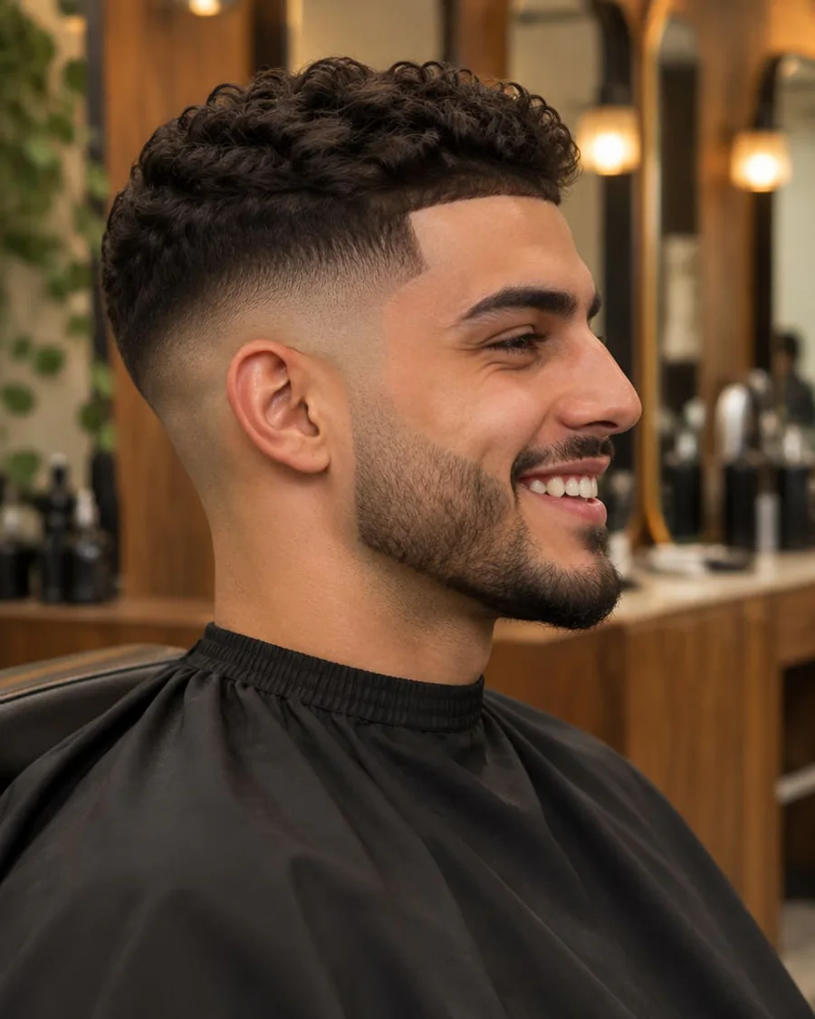
A barber template puts the bookable cuts with prices at the top, recent work underneath, then opening hours, reviews and a map. That order follows what a new customer wants to know: can I book, what does it cost, are they any good, where are they. Starting from it means you inherit that thinking and only supply your own details.
The trap is treating a template as finished. A page that still says "Sunday wheel class" when you teach on Wednesdays, or an email with someone else's photo, does more harm than a plain page. The rest of this guide is about the short list of changes that turn a template into your page.
Pick the template by the job, not the looks
Before you browse, answer one question: what's the single most useful thing a stranger can do from your page? Book a slot, join your list, buy something, listen, donate. That answer decides your template, because a template is mostly a decision about what comes first.
Your page's main job
Templates built around it
What sits at the top
Take bookings
Dre's Barbers, Willow Lane Vets, Noor Rahman
A booking block with the service, length and price
Grow an email list
Marco Bellini, Lucía Ortega
A sign-up form with a reason to join
Sell products
Reya Atelier, Hana Kattar, Sana's Bakehouse
A shop link to the thing people come for
Get people listening or watching
Two Mics Club
Links to each podcast app, side by side
Raise money or find volunteers
Riverside Food Bank
A donate button
Colours, fonts and photos are the easiest things to change, so don't rule out a template because it's the wrong colour. A potter can start from a bakery template if its order of blocks fits the way they sell.
Two templates, two jobs. Dre's Barbers opens with three bookable cuts and their prices. Marco Bellini's page opens with a sign-up form for his Sunday recipe letter, because his list is what he's building.
Your first ten minutes: what to change, in order
You don't need to rebuild a template to make it yours. These five changes, in this order, do most of the work.
1. The photos. Swap the profile photo and any pictures for your own. A clear photo of your face or your work beats a polished stock image, because people follow you for you. For a wide cover picture, use a photo with space around the subject so it crops well.
2. Your name and one line about you. The line under your name should say what you do, for whom, and where, in plain words. Dre's template says "Clean fades, sharp beards and good conversation. Walk-ins welcome, bookings preferred." It tells a stranger what the shop does, what it's like, and how to get a chair. Write yours the same way, then read it aloud. If it sounds like an advert, cut it down.
3. The words on every button. Template buttons say things like "Book a spot" or "Join". Make each one specific: "Book a skin fade, $35" or "Get the Sunday recipe letter". People skim buttons, so the button has to carry the whole message on its own.
4. One brand colour. Change the button colour to the main colour of your logo or shop front and leave the rest alone at first. One colour you own is enough for people to recognise you. Check the button text is still easy to read; if not, go darker.
5. Delete what you can't fill. No reviews yet? Remove the reviews block rather than leaving the sample quotes in. No studio? Remove the map. A made-up block costs more trust than it earns.
That's it for day one. Publish the page, put it in your bio, and improve it as you go. Our guide to how to add a link to your Instagram bio covers the last step.
Make the first block do one job
On a phone, the first block is often all a visitor sees before they decide whether to scroll. Whatever sits there should be the one action you most want, and it should make sense on its own.
Kenji Mori's page opens with a photo of him at the wheel, then straight away the Sunday wheel class: two and a half hours, in person, $60, with a "Book a spot" button. Someone who's just watched one of his videos can book without scrolling. His latest pieces, studio hours, map and mailing list are further down for people who want more.
Kenji Mori's page, top and further down. The class is bookable from the first screen; the latest pieces, studio hours, map and a sign-up for new work come after it.
If you have two equal jobs, such as a free intro call and a paid session, put them next to each other at the top and make the free one the obvious first step. Noor Rahman's template does exactly that, with the free discovery call above the full consultation. What to avoid is a stack of six equal buttons, which leaves the visitor to work out what you want them to do. There's more on ordering in our link in bio examples, and on bookings in how to take bookings from your Instagram bio.
Build a small email rhythm from the templates
Your page brings people in; email is how you keep them. You don't need a complicated schedule. Four kinds of email cover what most creators and small businesses need, and there's a template to start from for each.
Coupon offer, Flash sale, Members discount, Birthday gift
A monthly letter
Once a month, on roughly the same day
Personal note, Weekly letter, Monthly roundup
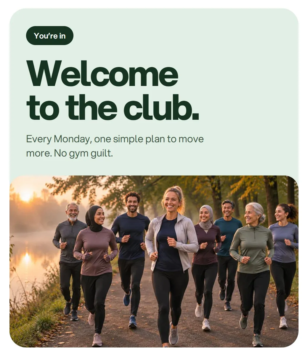
The welcome is the most important email you'll send, because it goes out when interest is highest. Keep it short: thank them, give them what you promised, and ask one question they can answer by hitting reply. Sofia Lind's welcome does all three, with a button for the free 7-day plan and a closing line asking new members what they want help with.
The booking reminder is the one that saves you money. People forget, and a reminder the day before catches most of them: in one multi-site trial published in JAMA, missed appointments fell from 24% to 14% when reminders were introduced. The template lays out when, where, the service and who it's with, then an "Add to calendar" button and links to reschedule or cancel.
The offer works best when it's rare. A code every week teaches people to wait for the next one. Send it when there's a reason: a first order, a birthday, a new collection.
The monthly letter is what keeps people glad they joined. It doesn't have to sell anything. Kenji's "Personal note" template is a short, honest update under a single photo, signed with his name. If you're not sure what to write, our guide to growing an email list from Instagram and TikTok has ideas for what to send.
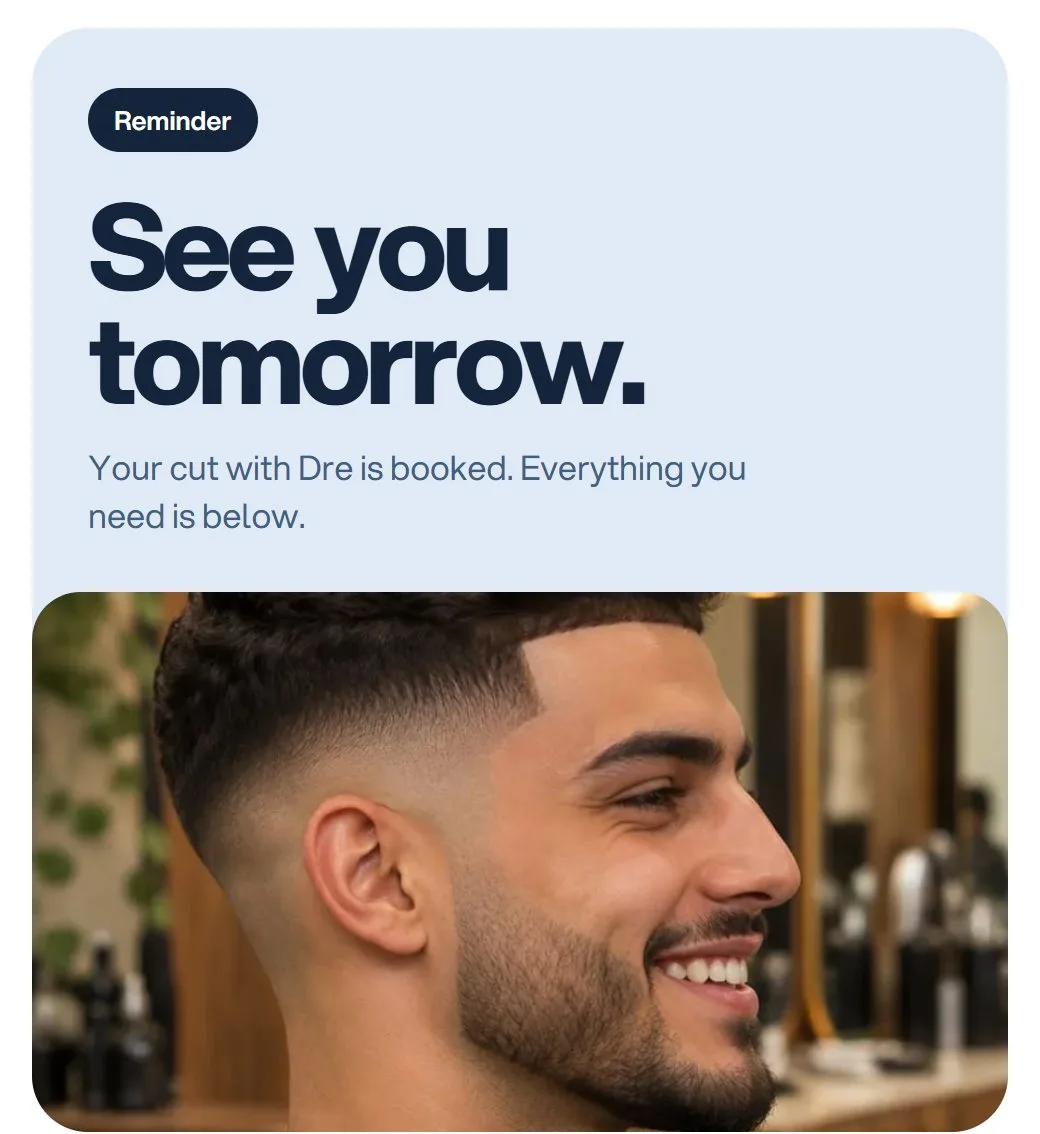
Sofia Lind's welcome, with the free plan as its one button, and the day-before reminder for Dre's shop, with the time, address and service written out as text.
Make your page and your emails look like one brand
Most of the email templates were designed alongside a page template for the same made-up business. Kenji's page has three emails to match it, Dre's shop has its booking reminder, Noor has a coupon and an order thank-you. When you preview a page template you'll see "Emails to match", and when you preview an email you'll see "Goes with this page".
This matters more than it sounds. Someone who joined from your bio three weeks ago won't remember the moment, but they will recognise your photo, name and colour in their inbox. An email that looks like it came from somewhere else is easier to ignore, or to mark as spam.
Matching is simple once you know what to keep the same:
The name. The sender name on your emails should be the name on your page, not a company name people have never seen.
The photo. Use the same profile photo, or at least the same person or product, at the top of both.
The button colour. Make your email buttons the same colour as the buttons on your page.
The voice. If your page says "I", your emails should too.
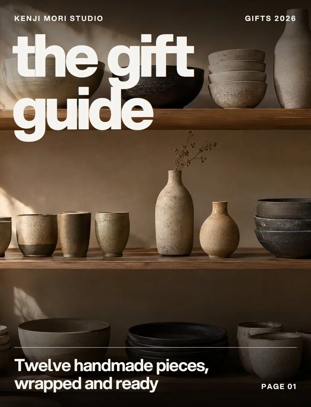
One brand in two places. Kenji's page, his gift guide and his personal note share the same name, the same warm studio photos and the same quiet, handmade feel.
Editing tips that hold up in real inboxes
Emails are read in dozens of different apps, mostly on phones, often in a hurry. These habits keep a template looking right once it lands.
Type over the details every time. In the booking, reservation and coupon templates, anything that changes from one send to the next (dates, times, addresses, prices, discount codes) is ordinary text in the email, not part of a picture. Click it and type your own. Then check it twice, because a wrong date in a reminder is worse than no reminder.
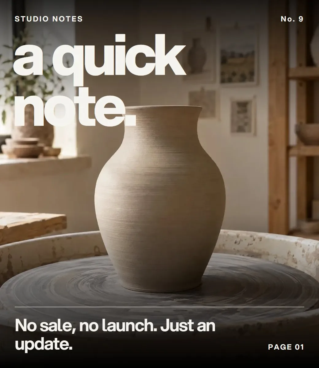
Swap the designed pictures for your own. The posters, colour cards and magazine covers are images, so the big headline words inside them belong to the picture. That's deliberate: email apps only reliably show a few basic fonts, and a picture keeps the design intact everywhere. To change those words, replace the image with your own design or photo. If you'd rather not design anything, a photo plus a plain heading block works well.
Keep one main button. Every template has a single primary button for a reason. Two competing buttons split attention and usually lower the clicks on both. If you have a second link, put it in the text as an ordinary link.
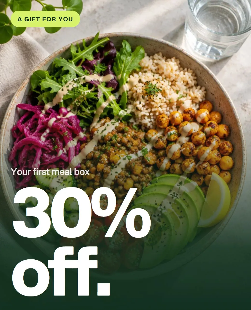
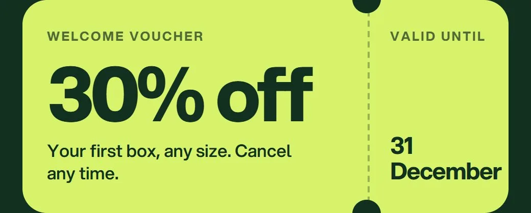
Write the subject and preview text last. The preview text is the grey line that shows after the subject in most inboxes, so treat the two as one sentence. The Coupon offer template pairs "A gift: 30% off your first box" with "Use code FIRSTBOX30 before 31 December". Between them, the reader knows what it is, what to do and when it ends, before they open it.
Check it on a phone before you send. Two-column layouts stack into one column on a narrow screen, so look at the phone view and make sure the order still reads well. Then send yourself a test and open it on your own phone.
Three setups to copy
Here's how three different businesses could put a page and a couple of emails together on the first day.
A barber: Dre's page and the booking reminder
A barber's page has one job: fill the chairs. Start from Dre's Barbers, change the three services to your own prices and lengths, swap the "Fresh this week" photo for a cut you did this week, and update the hours and the WhatsApp button.
Then set up the Booking reminder email: your shop name in the logo, your address under "Where", a photo of your shop, and keep the line offering to hold a late client's spot for 10 minutes. Before each send, type in the date, time and service. People book from the bio and get a reminder that looks like the page they booked from.
Dre's page and the reminder that goes with it. The appointment details are live text, so they're typed in fresh for each booking.
A potter: Kenji's page, the gift guide and new booking slots
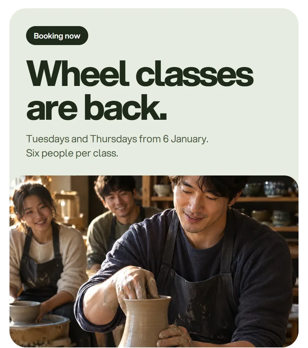
A maker usually sells two things: their work and their time. Kenji's page has the weekly class at the top and the latest pieces below. Change the class to your own day, length and price, and point "The latest pieces" at wherever you sell your work.
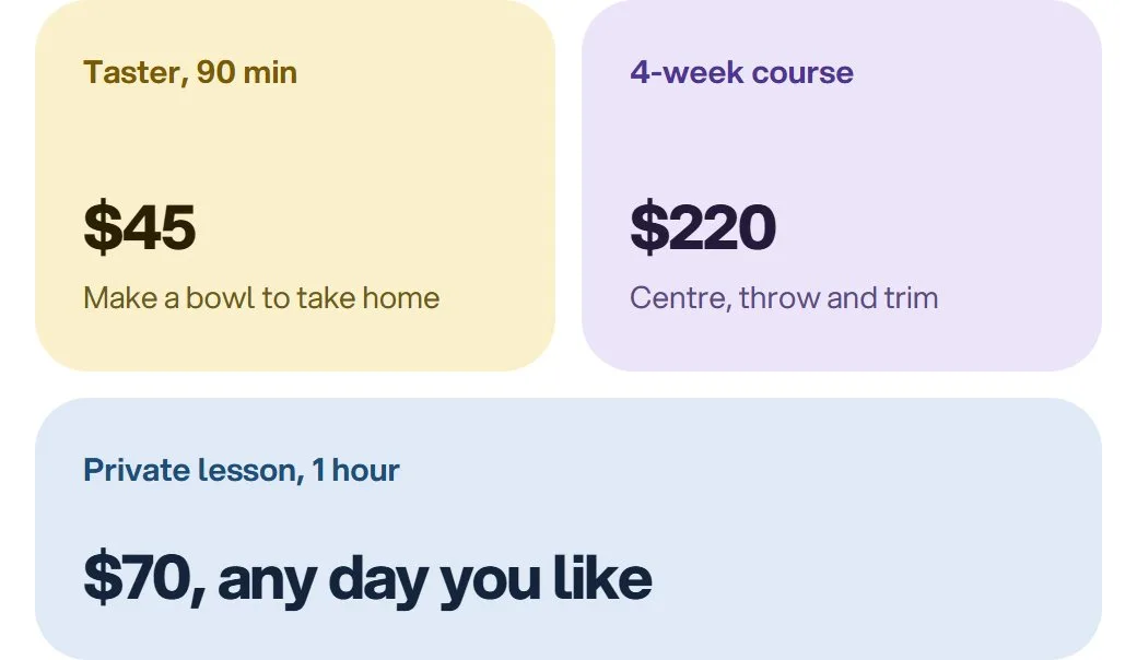
For email, two templates cover the year. The New booking slots email announces a new run of classes with a photo card, a price card and a "Book a class" button; send it the week your dates open. The Gift guide shows four pieces in two columns with prices, and a clear last-order date for holiday delivery. In New booking slots, the class prices sit on the designed price card, which is a picture, so swap that card for your own or replace it with a text block. In the gift guide, the product names and prices are text you can type over.
Kenji's page with the two emails a maker needs most: the gift guide, with products and prices in two columns, and the announcement for a new run of classes.
A nutritionist with meal boxes: Noor's page and the coupon offer
Noor Rahman's page puts a free discovery call first, the paid consultation second and a free 7-day meal plan below: an easy first step, then the paid one, then something for people who aren't ready to talk yet.
If you also sell weekly meal boxes, the Coupon offer email turns a first order into an easy yes: 30% off the first box, a big, clear code, and two short steps explaining how to use it. Change the code and the end date to your own (both are text you type over), keep the small print short, and send it to people who joined from your free meal plan. Our guide to selling digital products from your link in bio covers how to follow up with people who weren't ready on day one.
Noor's page, discovery call first, and the coupon email with its code written as text, ready to change.
Using the templates in Glee
You can browse every bio page template and email template on this site without an account, open any of them to see every block, and filter by what you do. "Use this template" takes you to sign up, and the same templates are in the Glee app when you create a page or an email. Everything in them is an ordinary block, so you can move, change or delete any part.
There are a few honest limits. Glee doesn't have its own checkout, so the shop links on product templates point to wherever you already sell. Free sessions book directly in Glee; paid sessions go through Cal.com or Calendly. Sending email needs a verified sender connected in Glee. And the templates are a starting point, not a substitute for your own photos and words: the pages that do best are the ones that look the least like a template.
If you'd rather describe what you want, Glow, Glee's built-in AI, can build a page from a sentence, something like "a page like the barber's, with my three services, my hours and a WhatsApp button", and waits for your approval before anything goes live. For more ideas on what to put on the page itself, see 25 link in bio ideas.
Frequently asked questions
What is a link in bio template?
A link in bio template is a ready-made page with the blocks, order, colours and fonts already chosen for a particular kind of business, such as a barber or a coach. You add your own photos, words and links, and publish it as your page.
How do I choose the right link in bio template?
Choose by the first block, not the colours. Decide the one thing you most want visitors to do, such as book, sign up, buy or donate, and pick a template that puts that action at the top.
What should I change first in a template?
Change the photos, your name and one-line description, the words on every button and one brand colour, then delete any block you can't fill with something real, such as sample reviews.
Which emails should a small business send?
Most need four: a welcome when someone joins, a reminder the day before a booking, an occasional offer, and a monthly letter. Start with the welcome, because it's sent when interest is highest.
Should my emails match my link in bio page?
Yes. Using the same name, photo, button colour and voice helps subscribers recognise you in their inbox, which makes them more likely to open your emails and less likely to mark them as spam.
Can I change the text inside email template images?
The headline words on the designed posters and cards are part of the image, so you change them by replacing the image. Details that change with every send, such as dates, prices and discount codes, are ordinary text you can type over.
Your link in bio, done for you.
Tell Glow what you sell and who it's for. It builds the page, the bookings and the emails, then waits for your yes.